[Update on 3/21/20]
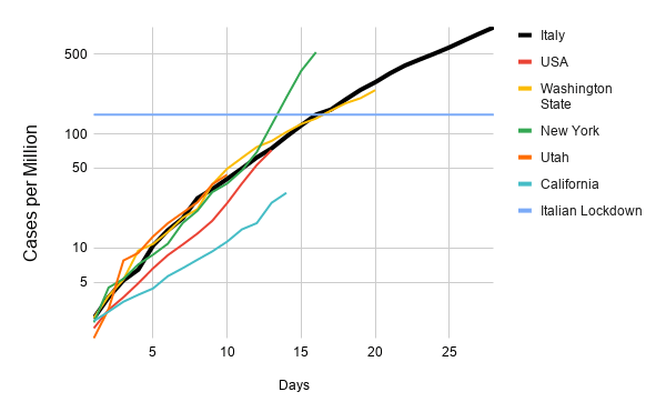
Italy: 12 days into their national lockdown, the number of new diagnoses continues to increase. I’m still cautiously optimistic that the true number of new infections peaked on March 9th or 10th. And I still expect the fatalities per day to trend upwards until April 3rd before dropping sharply.
New York: The number of cases continued growing faster than the typical exponential rate seen elsewhere. This likely reflects that testing is still catching up. Whatever the reason, New York needs all the help they can get.
California: New cases accelerated since I posted yesterday morning, but the overall caseload remains far below Italy, New York, or Washington. It will get worse here before it gets better, but if the trend continues it may be reasonable to shift resources from California to New York.

[Update on 3/20/20]
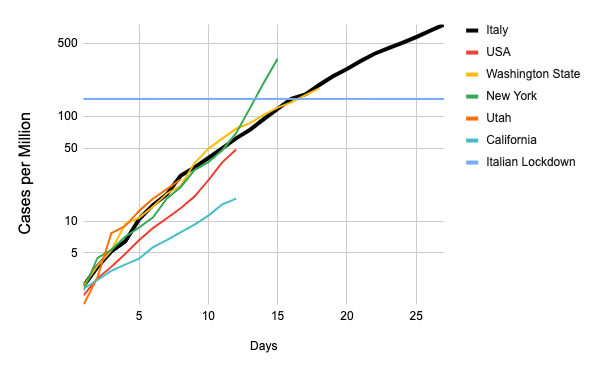
Italy: The rate of new confirmed cases in Italy continues to increase (5986 from 5322) 11 days after they began their national lockdown. I still believe the true rate of new cases must have maxed out on March 9th or 10th. The number of new deaths also grew substantially today (not plotted, 627 up from 427). Sadly, I expected these numbers to continue to increase until about April 3rd.
New York: They’ve had a huge uptick today and the day is far from over. This is likely due to massive increases in testing (but then why isn’t the same thing happening in Washington, California, and Utah?). They’ve apparently followed California’s lead on telling everyone to go home except for essential workers.

[Original post]
I’ve seen plots flying around of the growth rate of coronavirus in different countries, shifted around by different definitions of “start date” so the lines fall on top of each other. They fall on top of each other because at first there’s exponential growth with the rate determined by the virus.
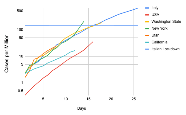
Here I’m going to make my own case plot with a couple twists. First, I’ll break the US into states. The baseline coronavirus model I wrote about two posts ago presents the US as a set of regional epidemics. States can and are implementing different virus suppression measures. Only looking at the total hides the different consequences of these varied approaches. Second, I’ll normalize by population. Then we can see how different areas compare to Italy both now and when Italy enacted its national lockdown.

The USA as a whole has a similar growth rate, maybe even a bit higher, but is starting from a much lower base than the others. This is likely because the US really has a bunch of separate outbreaks all piling on top of each other with lots of room to grow. The California outbreak is growing noticeably slower than the others. The horizontal blue line is the level in Italy the day they started their national lockdown. California starts a similar, slightly less restrictive shelter-in-place tomorrow even though we’re at a much lower infection rate. Likely our leaders’ aggressive response accounts for at least part of the slower growth rate. New York and Washington are now both past the level at which Italy locked down. New York is also growing very quickly. It’s hard to tell in the fog of pandemic if this is because of increases in testing or not. California has supposedly ramped up testing, but hasn’t seen a spike in growth rate.
Here’s a link to my raw spreadsheets. One discouraging point is that a full 10 days after Italy’s lockdown, their number of new cases per day is still increasing. With a 5 day incubation time, I’d hoped new cases would start to drop after the 5th day. We can throw our hands up again and attribute this to testing, but by now we’re asking fluctuations in testing to explain an awful lot. The simpler truth is probably that this is a complex, chaotic situation with a great deal of underlying randomness. But everything we know about infectious diseases tells us that lockdowns/shelter-in-place orders should stop the spread.

