
When am I going to die? The Social Security Administration’s actuarial tables tell me a 32-year-old male has a remaining life expectancy of 46.00 years. To refine that estimate, I can look at papers like this one that compare life expectancy depending on modifiable risk factors. A 50-year-old male who does five healthy things (1. Maintains healthy weight 2. Doesn’t smoke 3. Drinks moderately 4. Exercises 5. Eats a healthy diet) lives 12.1 years longer than a 50-year-old male who does zero of those healthy things.
But this approach has a few shortcomings for my purposes. First, I am not 50. Second, the average male does more than zero healthy things, so even if I were 50 I couldn’t add the 12.1 years to the average life expectancy. Remaining life expectancy for a 50-year-old male is 29.9 years and life expectancy for our 50-year-old male health nut is 37.6, so maybe I add 7.7 years to the average if I also do all the right things? The same calculation for a woman yields a gain of 9.6 years. Third, it doesn’t tell me what will kill me and how else I could further extend my life expectancy. (Also, fourth, I am a type 1 diabetic, which affects my mortality but does not appear in the list of healthy or unhealthy behaviors.)
In this post, I’ll combine the SSA data with CDC data on causes of death and a bunch of scattered sources to estimate hazard ratios for different causes of death for me and my wife Kelsey. Out of that melange will come two things: (unreliable?) life expectancies and a fun spreadsheet I can use to see what happens to our life expectancies if we do various healthy or risky things.
Read on for the most popular ways to die.
Leading causes of death
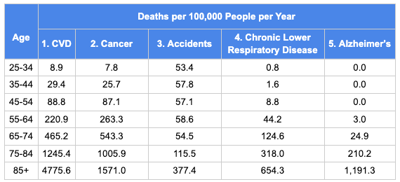
The table below has the CDC data for deaths per 100,000 people per year. I’ve combined heart disease and stroke into the single category cardiovascular disease (CVD), in line with how most papers report risk factors. Later on I’m going to break “accidents” into several sub-categories that have different risk factors (drug overdoses, car accidents, and falls).
And here is the same data rearranged as fractions of all deaths by age group.

A few features jump out. First, every cause of death speeds up with age. Second, CVD increases its share of all deaths as people age. Cancer is neck-and-neck with CVD until 75, but by 85+, cancer is getting lapped by CVD. Looking from left to right, you may think, “wow, chronic lower respiratory disease grows so much faster than CVD or cancer!” For the 85+ cohort, the mortality rate from CLRD is over 800 times the 25-34 cohort. But then you see Alzheimer’s, with a mortality rate that’s infinity times higher in the 85+ cohort than for people under 55.
Modified life expectancy
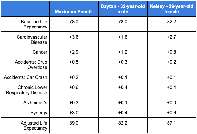
With that data in hand, for every age, I’ll break the total death probability into the probability of death by cause. Then I’ll make some crude adjustments along the lines of, “Kelsey has orange hair and people with orange hair are half as likely as average to die of an aardvark attack,” and I’ll reduce Kelsey’s probability of dying at every age by 0.5 x (the probability of dying of an aardvark attack). With the new table with Kelsey’s probability of dying at every age in hand, I can calculate her new life expectancy. For each cause of death, I’ll also look at the maximum possible benefit (for a 32-year-old male).
- Cardiovascular disease
Maximum benefit: 3.6 years
Dayton benefit: 1.6 years
Kelsey benefit: 2.7 years
If I set my relative risk for CVD to 0 – meaning I am immune to CVD – my life expectancy only increases 3.6 years. This result will become a recurring theme of this post. Every cause of death grows with age, so curing one or two of them makes only a small difference. That should set expectations for how amazing it is that doing all the healthy things increases life expectancy so much.
Anyway, I’m not immune to CVD. What’s my actual relative risk for CVD? There are many online risk calculators for CVD backed by mounds of data. For this post, I’ll rely on the QRISK3 calculator. It has two useful features for this post: it includes type 1 diabetes as a feature and it forecasts 10-year risk of heart attack or stroke. It tells me my 10-year risk is 1.4%. This paper reports incidence of CVD by sex and 10-year age group. It starts at 45, though, so I’m going to lie to the QRISK3 calculator and tell it I’m 45 instead of 32. That raises my risk to 5.4%, compared to the average 10.1% for 45-year-old men. So I’ll say my relative risk is 0.5, which gains me 1.6 years of life expectancy.
If Kelsey were 45 years old but otherwise her actual self, QRISK3 says her 10-year CVD risk would be 0.9%, compared to the average of 4.2% for women her fake age. That gives her a CVD relative risk of 0.2. These results – 0.5 for me and 0.2 for Kelsey – are self-consistent. We both exercise and eat healthy and don’t smoke, but my type 1 diabetes doubles my CVD risk.
- Cancer
Maximum benefit: 2.9 years
Dayton benefit: 1.2 years
Kelsey benefit: 0.8 years
In this paper, a group of scientists at the American Cancer Society estimate what fraction of cancer cases and deaths are attributable to a list of known risk factors. In my spreadsheet, I make rough guesses for how much of each risk factor Kelsey and I have. Smoking: none, UV radiation: half of normal, and so on. My total risk is reduced 43%; Kelsey’s is by 36%. The gap isn’t because I’ve done something healthy that Kelsey hasn’t. It’s because many more cancer deaths are caused by smoking in men than in women, so by not smoking I’ve gained more relative to average than Kelsey has.
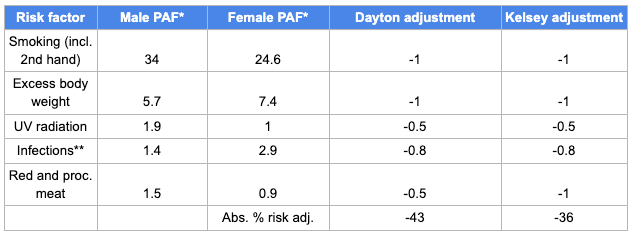
*PAF = population attributable fraction
**“Infections” is my summary of Hep C, HIV, HPV, herpes, and H pylori. I assume we’re at 0 risk for all but H pylori, because apparently most people get it as children and don’t know they have it.
- Accidents
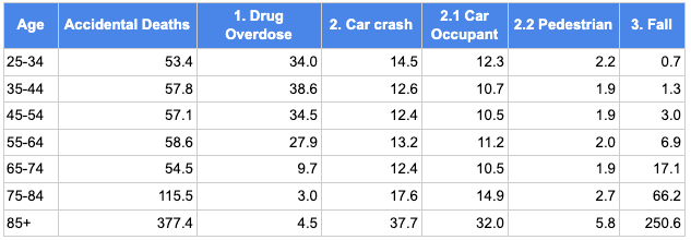
The “accidents” category is made up mostly of three groups: drug overdoses, car accidents, and falls, with a long tail of other rare accidental causes of death. Drug overdoses are the one common cause of death that declines with age. Car accident deaths increase a bit with age. Falls increase by over 350x from under 35-years-old to over 85-years-old.
I’ll assume Kelsey and I are at average risk of fall deaths.
3.1. Drug overdose
Maximum benefit: 0.5 years
Dayton benefit: 0.3 years
Kelsey benefit: 0.2 years
We’ve made it this far in life without a drug problem, but it would be too optimistic to assume there’s no chance we end up with surgery or chronic pain that leads to an opioid addiction. I combined this data source for the distribution of education in America with this data source for overdose death rates by education level to calculate that Kelsey and I, as people with graduate degrees, have a relative risk for overdose death of 0.3 compared to the average person.
3.2 Car crash
Maximum benefit: 0.2 years
Dayton benefit: 0.1 years
Kelsey benefit: 0.1 years
I’ll sub-sub-divide this category into car occupant deaths and pedestrian deaths. I’ll assume we’re at average risk for dying as pedestrians. As for death as car occupants, I start with our monthly driving miles, then multiply by the fatality rate per passenger mile. Based on an old post of mine about how to reduce your risk of dying in a car accident, I multiply by 0.6 for always wearing a seatbelt and 0.47 based on IIHS real-world safety data for our 2017 Subaru Forester. After all that, compared to the average American, I calculate that we have a relative risk of 0.25 of dying in a car crash as occupants of the car.
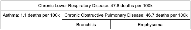
- Chronic Lower Respiratory Disease
Maximum benefit: 0.6 years
Dayton benefit: 0.4 years
Kelsey benefit: 0.4 years
CLRD includes three conditions: bronchitis, emphysema, and asthma. The first two are grouped together under the label Chronic Obstructive Pulmonary Disease (COPD). Until 1999, the CDC, following the WHO, treated COPD and asthma as separate top-level categories. The West Virginia Department of Health and Human Resources has an excellent page describing the three conditions. Patients with COPD typically have both bronchitis and emphysema. That explains why the CDC page on CLRD just codes most CLRD deaths as “excluding asthma” without further specifying bronchitis or emphysema.
According to that West Virginia page, 80% of COPD cases are caused by tobacco, other pollution accounts for 15%, and genetic factors for the last 5%. I’m tempted to say that because Kelsey and I are both non-smokers, wear N95 masks outside when the air is bad, and have HEPA filters inside our apartment I should estimate our risk as 5% of average (or even lower because we don’t have any relatives with COPD?). But that seems a little too optimistic.
This CDC paper about COPD reports that 6.2% of all adults have COPD, versus 1.6% for college graduates who never smoked, for a relative risk of 0.26. I’ll assume those demographics capture the bulk of the ways in which Kelsey and I have reduced our COPD risk. And for simplicity I’ll assume we have the same relative risk for asthma death, though at 2% of all CLRD deaths our relative risk for asthma is a rounding error in this calculation.
- Alzheimer’s
Maximum benefit: 0.3 years
Dayton benefit: 0.1 years
Kelsey benefit: 0.0 years
Of the causes of death I’m covering in this post, Alzheimer’s seems to be the least preventable. The 2020 Lancet Commission identified 12 risk factors that contribute to dementia (a broader category than Alzheimer’s) and broke down what fraction of dementia cases are due to each one. As I did above for cancer, I made some rough judgment calls for how much of each risk factor Kelsey and I have. Most dementia cases are unexplained by known risk factors and many of the known risk factors are difficult to modify. (How do you reduce your risk for traumatic brain injury?) My estimate is that I have a 0.80 relative risk and Kelsey has a 0.87 relative risk of Alzheimer’s. Kelsey’s higher risk than I am because Alzheimer’s is the only cause of death on this list that’s a bigger risk for women than men.
Synergy
Maximum: 3.0
Dayton: 0.4
Kelsey: 0.6
For each of the above causes of death, I’ve evaluated the gain for reducing that cause of death alone. Reducing your risk of multiple causes of death has a larger benefit than the sum of reducing either one alone. I calculate that curing every cause of death in this list would drive a synergy of 3 years of life gained. Kelsey and I achieve a more modest synergy of about half a year from our risk reductions on each cause.
What next?
Thanks to our healthy habits, I’ve gained about 4.2 years of life and Kelsey has gained 4.9 years relative to average. My gain is smaller than the 7.7 years I’d expect to gain based on the healthy habits paper, and Kelsey’s gain is smaller than the paper’s projected 9.6 years. Why the discrepancy? At least one of these three things must be true:
- that paper could overestimate how much there is to gain by adopting a healthy lifestyle,
- much of the benefit could come from causes of death beyond the top five (which is all I consider), or
- I could be underestimating how much these five causes of death decrease with a healthy lifestyle.
Some other discussion points:
- Cardiovascular disease is both the leading cause of death and the most modifiable cause of death. From both a personal and public health perspective, it might make sense to focus additional resources on CVD instead of cancer or Alzheimer’s.
- My spreadsheet relies on 10-year age groups up until 85, then clumps everyone else into “85+”. This approximation might lead me to underestimate the gains to curing CVD, which continues to grow as a fraction of all deaths for people over 100.
